The soul cannot bear a yellow surface which is limited and defined in extent. So we must make the yellow paler towards the edges, and then still paler. In short we must have a full yellow in the centre and from there it must shade off to pale yellow. You cannot picture yellow in any other way, if you want to feel it with your own being. Yellow must radiate, getting paler all the time. That is what I might call the secret of yellow. And if you hem in the yellow, it is in fact as if you laughed at it. You always see the human factor in it, which has bounded the yellow. Yellow does not speak when it is bounded, for it refuses to be bounded, it wants to radiate in some direction or other.
Steiner, The Colour Lectures, May 7, 1921
This week, I jumped into Steiner’s lectures, as I do when I feel like I need guidance. I highly recommend reading the Colour Lectures for anyone looking to understand more about colour, and his guidance was just what I needed! The quote above can be found in chapter two of the lectures. Doesn’t it just speak to the yellow experience! My children always called yellow the “bossy” colour, because it just wouldn’t be contained and would often be the colour that popped on the page. Steiner’s Colour Lectures can be found on the Steiner Archives, or by clicking here
I spent this week experiencing some free painting with yellow, but I actually continued to play around with the first three exercises some more during the first part of the week, and found that to be really helpful. I also ended up digging out a tube of ocher that I had at home in hopes that it might create more of a contrast. Using that instead of the deep cadium, made the world of difference in contrast between the colours for those first three exercises.
After working through the reflective assignment where I record words that reflected my yellow experience and yellow itself, I moved on to the free painting. Lord suggests creating yellow paintings inspired by your inner moods or based on themes from nature. she also suggested recreating a famous painting where yellow is the predominant colour. I really couldn’t think of anything original to paint so I went with using her painting examples as inspiration.

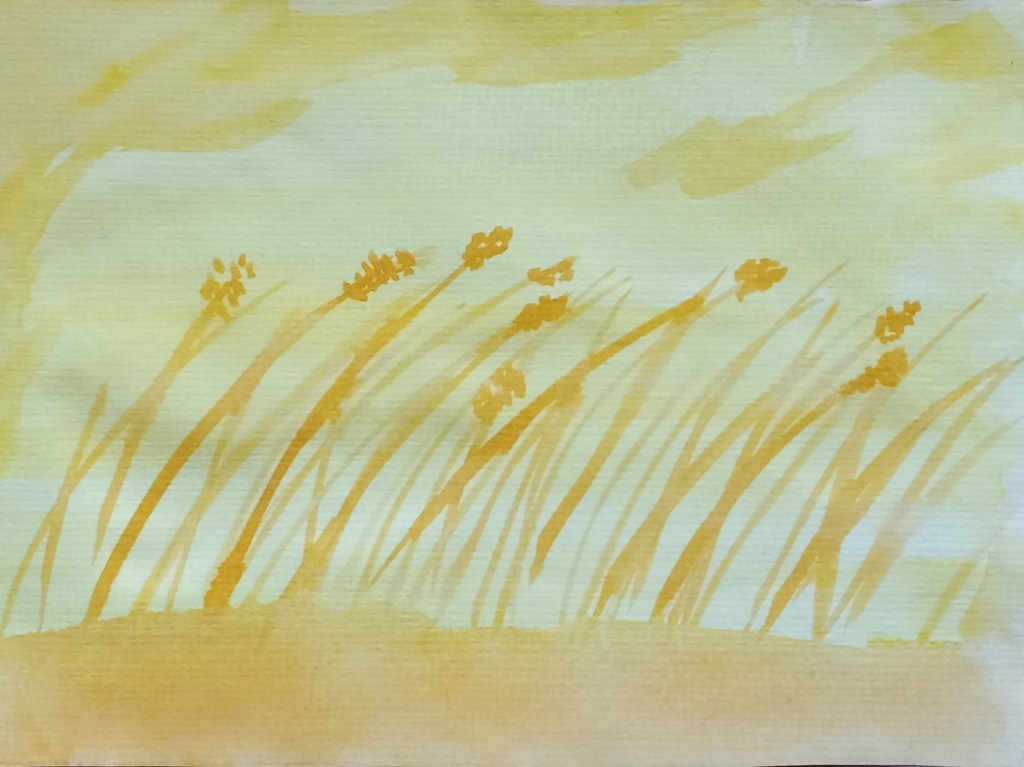
This was my nature inspired drawing. Much happier with the contrast when I switched to the ochre. It looks quite orange in the photo but it was much more yellow in reality. I really felt much more movement in this free painting. I might have also been because I wasn’t looking for a specific outcome as I was in the first three guided exercises.

I’m very happy with my wheat. This was inspired by an image the author included and it was a fun experience to purposefully create movement as the wheat blows in a breeze. It also gave me an opportunity to play around with layering and creating a grounding space for the wheat to grow from.

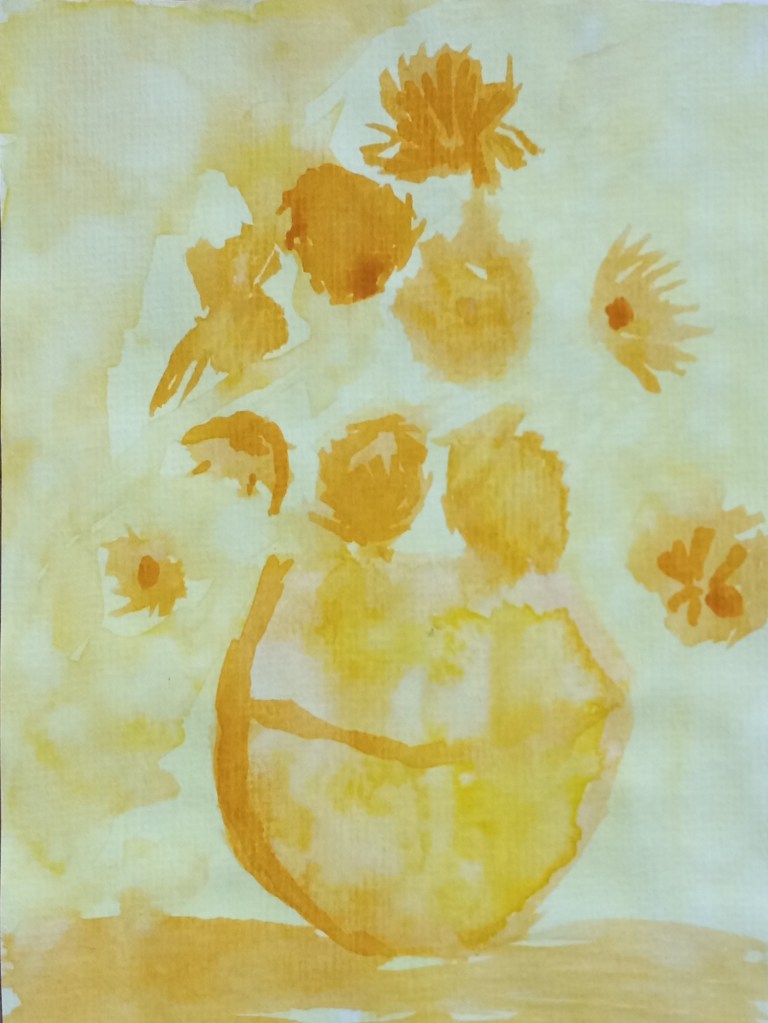
Van Gogh’s Sunflowers was also one of the included painting examples and it is one of my favourite Van Gogh paintings so I chose to try it out. I did some work in layering again, working first on the back ground and adding the detail of the vase and flowers after but lost much of the movement because the paper dried more than I expected so there are some stronger lines than I wanted.
Overall I’m really happy with my free painting experience. I felt like, even though two of the paintings were created from examples, I felt much more freedom and exploration during the experience.
Overall, my entire yellow experience was a bit middling. I think much of it had to do with needing a deeper contrast in tones. But I really value that the book has an impulse of playing with the colour to it which helps release some of the old baggage I carry when it comes to painting.
My advice to anyone starting out with this book is to do swatches of colour before each colour exercise to make sure you have a contrast.
So, onward we go! Blue is next 💙
Warmly,
Marina
Discover more from Growing Together in Freedom
Subscribe to get the latest posts sent to your email.

