
Yellow was the colour this week and I have lots of thoughts. I completed each exercise three times. Reminder: No help from the experts! Doing is learning
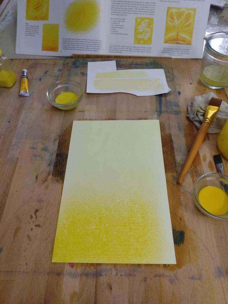
1. The supplies list suggested two yellows; lemon yellow and deep cadmium. For the yellow exercises however, it seems Lord uses a much deeper orange-yellow to achieve the contrast. I noticed this when selecting paint, but decided to stick with her recommendations and see what happened. What happened was not enough contrast or definition. My yellow did not “move”. The two shades were almost identical as seen in the swatch above my painting in the picture below. Initially, I scrapped my mixed yellows thinking maybe I made them too weak, and the second time around I measured the paints and the water so they would have near identical strength. It did not make a difference.
2. I have experienced wet-on-wet painting with my children, as well as with my mentor guiding the set up process. These experiences gave me a leg up. Lord has wet-on-wet set-up instructions spread out in different areas throughout the book. It would be more helpful for the novice to have one section for wet-on-wet, and one for veil, instead of interspersing the two. It isn’t a big hurdle, but there was a bit of flipping back and forth. If you have never done wet on wet painting before and would like more guidance, Sarah Baldwin has shared a wonderful tutorial in her Sundays with Sarah videos on YouTube.
3. Remember that Lord wants you to experiment, to really get a feel for the colours and techniques by doing. For mixing the colours, she simply says start pale and add more colour as painting progresses. Be ready to face the inevitable doubt “is this too pale or is the page too wet?” Again, mucking about is what this book is about. I did find that for yellow, my page was probably too wet to start with, and that might have been what contributed some to the difficulty in seeing two distinct colours. I did not stop to correct this with my painting because I really wanted to work through the process as is, even if it wasn’t working! I did, however, after working through all the exercises once, reattempt each one paying attention to the discrepancies in my first attempts (page possibly too wet or too dry), and came up with very similar results.
Let’s talk about each exercise. This was a free painting with yellow all over the page to see movement. I think the two shades of yellow she recommended are not far enough apart in tone to really move on the page. The purpose was to fill the page with a variety of tones, but even when the two yellows were on top of each other, there was barely a darkening. You can certainly see varying shades on this page, but it is very subtle.
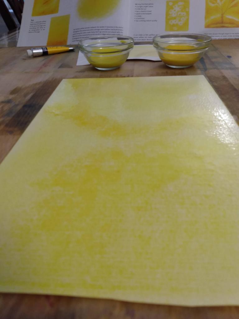
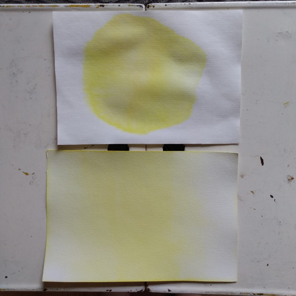
The second exercise was creating a gradient starting with lemon yellow on the top and gradually bringing the colour down to an oranage yellow. Only I didn’t have an orange yellow, so this is what we got. The painting on the right has an obvious gradient, but I used a much dryer page to get that definition. The painting on the left was perfectly wet but didn’t produce much of a gradient.
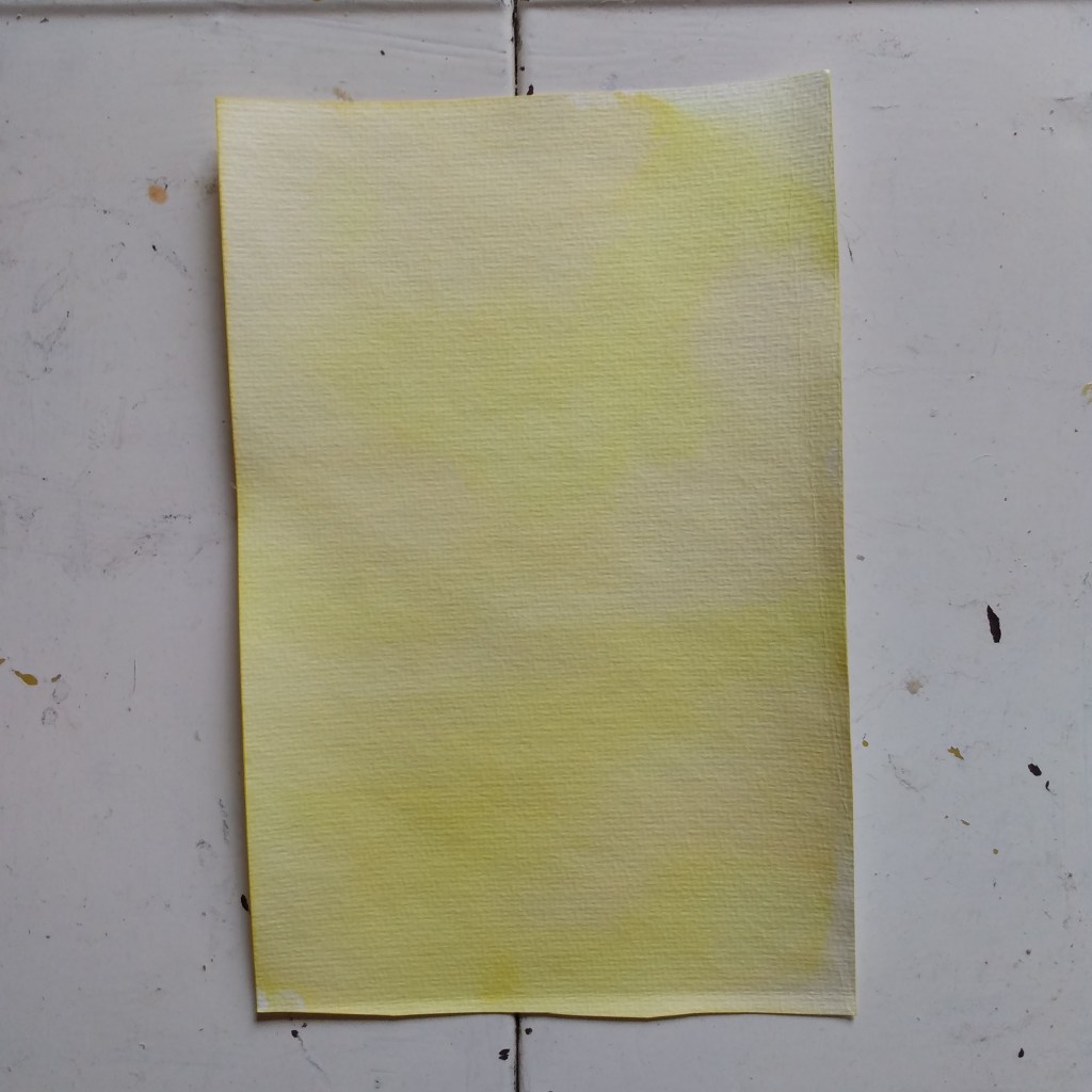
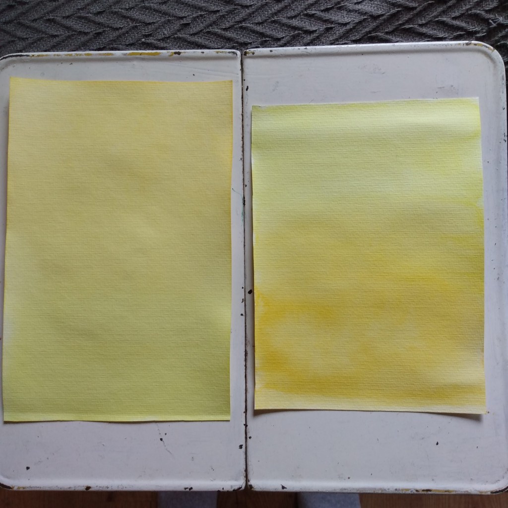
Here is an example of too wet/too dry. I include them because I think it is one of the hardest things to judge when starting with wet on wet, is how much water to use. It is something that I am much better at judging now after years of experience, but it is something that I still mess up every now and then. The top page became dry because I was called away by my children for just a few moments, but it made all the difference. I didn’t notice until it was too late, but I always continue because the experience of working with a page that isn’t just right helps to build the feeling for what IS just right. The third exercise is painting orbs, first pulling the yellow in, then out, creating a “breathing” into the white space. There are no circular movements, only a pulling motion from center and periphery. It is actually a beautifully calming exercise that has the ability to bring you back to a steady breathing rhythm.
4. I love that she encourages observation, reflection, and interpretation to help us feel the colours. Especially since as adults I think we tend to stay too much in the head and not enough in the heart while learning something new. But I think she goes too far in providing examples, because it feels like she essentially tells us what the colour is doing and how it makes us feel. A list of colour qualities at the back so we could discover for ourselves the effect of yellow might have been better. I don’t know. After reading her suggestions I felt really influenced. Maybe there are others who are not as weak of mind to be influenced by her words, ha ha.
Overall, I’m lukewarm about my yellow experience. Yellow in itself is a colour that tends to have a mind of its own and won’t always do what we painters expect or desire of it. And I *know* the painting experiences in the book are not about the product, it is the process that counts. I think part of the problem is letting go of the years of schooling where we are told “this is what you are to paint, make it look like this”, and then seeing Lord’s beautiful paintings and resisting the urge to “reproduce”. My paintings throughout this exercise were lackluster and didn’t have the same level of contrast the paintings she illustrated the book with, which I feel really affected the process. I do believe her shade suggestions had a huge effect on the experience.
I’ll try everything again this week, as well as some of the free paintings and see what happens. Stay tuned!!
Warmly,
Marina
Discover more from Growing Together in Freedom
Subscribe to get the latest posts sent to your email.
